Dashboard
- Ethel Karskens (Deactivated)
- Emily Ryan (Unlicensed)
Your dashboard is an overview of your company’s activity and impact. You can configure different kinds of filters and the dashboard will refresh.
As an Administrator you have access to all these features to monitor and evaluate you companies social corporate impact.
To find and use the dashboard you need to start by switching from "Employee" view to "Company Admin" view.
- On the "Employee" view homepage click "Switch view" at the top of the screen
- Select “Company Admin” from drop down menu. You will be re-directed to the page below
- Make sure your on the “My Company” logo on the left hand side of the screen in the navigation tab

- Select “Dashboard” logo

- You will be re-directed to a page similar to the one below
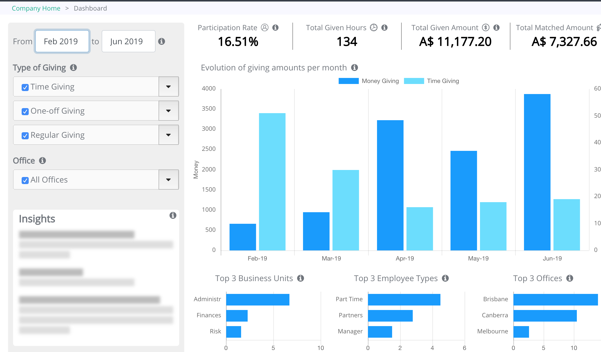
1.Filters
- Select the months of activity that you want to see in the bar as show below. Change the dates to the months you wish to see

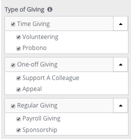
- Select the type of giving that you want to display. You can sub-select the module of the types of giving by clicking on the caret on the right
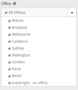
- Select the offices that you want to display. Simply check or uncheck the box depending on what offices you wish to be displayed
2.General insights
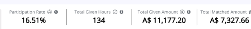
- The Participation Rate = The average of employees who have been active for the month(s) and the type(s) of giving selected. They are divided by the headcount of enabled employees for each month.
- The Total Given Hours = The total number of hours that have been given by the active employees for the month(s) and the type(s) of time giving selected.
- The Total Given Amount = The total amount donated by the employees for the month(s) and the type(s) of money giving selected. Matching amounts are not included.
- The Total Matched Amount =The total amount of dollars matched by the company for the month(s) and the type(s) of money giving selected.
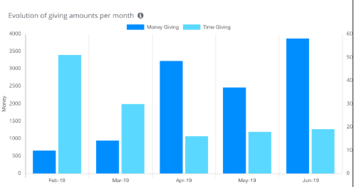
Evolution Chart
This chart shows the evolution per month of the amount of time and money, for the month(s) and type(s) of giving selected. Matching amounts are not included.
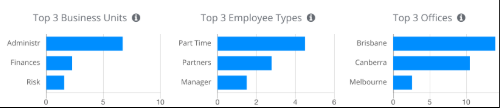
The top three’s
These three charts display the engagement of the business units, employee types and offices. The engagement is measured by the average of the number of contributions upon the headcount of active employees of the business unit/employee types and offices.
Distributions of contributions
These pie charts help you understand where the contributions go (or where they come from) across four categories: employee type, office, charity and cause.
| Version 21/1/20 |
|---|